How to make the most of your 404 page?
Categories:
14 minutes reading

Mistakes happen. That’s something you need to expect, especially if you are going in for a business of your own. Whether it is you, an employee, or someone else, mistakes will happen, and there’s nothing you can do about it. What you can do, however, is mitigate the damage and extract as many benefits from the failure as possible.
The same rule applies to your website. Errors are inevitable when people get to your online home, and you must be prepared. It matters little whether it is a broken link, a deleted article, or a wrongfully entered URL. What matters is not to lose the lead if (or better yet when) a reader gets to an unexisting page. This is where the 404 Error page comes into play.
Unfortunately, having a 404-page is not enough. There are some tips and tricks to make this page more efficient and draw as much benefit as possible from it. So, let’s have a look at how you can transform your 404 page and make it from a dead end into an opportunity to retarget lost audiences.
What is a 404 Page
The 404 page is an error page returned by the web server, also known as the “Page not found” error. If a user sees this page, it means that the provided URL path doesn’t lead to any particular information. To understand it better, you must have some basic knowledge about URLs. To get to a particular page within a domain, you need to enter at least three parts of a URL. The Protocol is the first part. The internet commonly uses the HTTP protocol. When the website has an SSL certificate, the Protocol gets an additional “S” at the end to signify it.
Next is the Domain name, which consists of your website’s name. Finally, you need to enter the Path (URI). The Path is the address of the particular page you want to bring to your screen, for example, https://www.hostarmada.com/blog/. Here “HTTPS” is the Protocol, “hostarmada.com” is the domain, and “blog” is the Path (URI). If a user enters “bog” (without “l”) instead of “blog” by mistake, our website will instantly redirect them to our 404 page. This happens any time when a browser asks the web server for a particular page, but the server has no information about such a page.
Reasons for such mistakes can be found both in the website owner and the users. Typically this happens when the user has a typo of some sort. However, broken links and deleted pages are also not outside the scope of causing such redirections. Thus, having some visitors accidentally on your 404 page is inevitable, so you might as well make these pages work for you.
Why do you need one
Having people on your 404 page is much better than not having them at all. Though they may not find what they want, users will still be on your website. If you crafted one truly good 404 page, they might continue their customer journey. The alternative is for their browser to show nothing. This way, even if the mistake is theirs, the users will remain dissatisfied, not knowing what went wrong. They might even consider your website to be down and not try again. A 404 page informs them there was a mistake. When they see a “Page not found” sign, users will instinctively check if they made a mistake. Most people are prone to think the error is on their end if someone else tells them there is a mistake. So, if the error is truly on their end, well, that’s a problem that resolves itself.
However, if the mistake is on your end, a 404 page can mitigate the damage and even retain the customer, despite them not finding what they were looking for. That’s why it’s crucial not only to have a 404 page but to customize it.
Why customizing your 404 page is a must
Customizing your 404 page may seem like a waste of time. After all, why would you invest additional time and effort into a mistake? Well, to transform this error into an opportunity, you need to make sure customers won’t bounce (leave the page) right after they see the error. Instead, with a bit of customization, you will ensure users will find it alluring enough to continue browsing. That’s one of the biggest benefits of customizing the 404 page. It will enhance the user experience, thus promoting engagement and reducing the bounce rate.
Moreover, you can still promote your brand and make sure your customers know exactly where they are. So having your page customized will inadvertently work as a brand awareness campaign.

Most importantly, however, the 404 page gives you a lot of opportunities to introduce new information to the users. For example, if a user looks for a particular service you no longer provide, you may explain why your new service is better, how it will benefit them, and why they should give it a shot, despite looking for something else. This way, you can not only reduce the bounce rate and retain customers, but you can also actively increase your sales and revenues. Retaining customers on your website is the first step toward a sale. So, yes, customizing your 404-page is a must.
Some 404-page customization dos
Doing just any customizations to your 404 page may end up being counterproductive. If you’re not careful, you may end up confusing the users, who already are confused enough because they didn’t end up where they thought they will. Of course, some tired and tested practices ensure you will make the most of your 404 page. So, let’s discuss them with some examples.
Make it on brand
As we discussed earlier, your 404 page should be an extension of your website. It should work both as a notice that something has gone wrong and as a brand awareness campaign. So, make sure you do your brand justice with your 404 page. An excellent example is Disney’s 404 page.
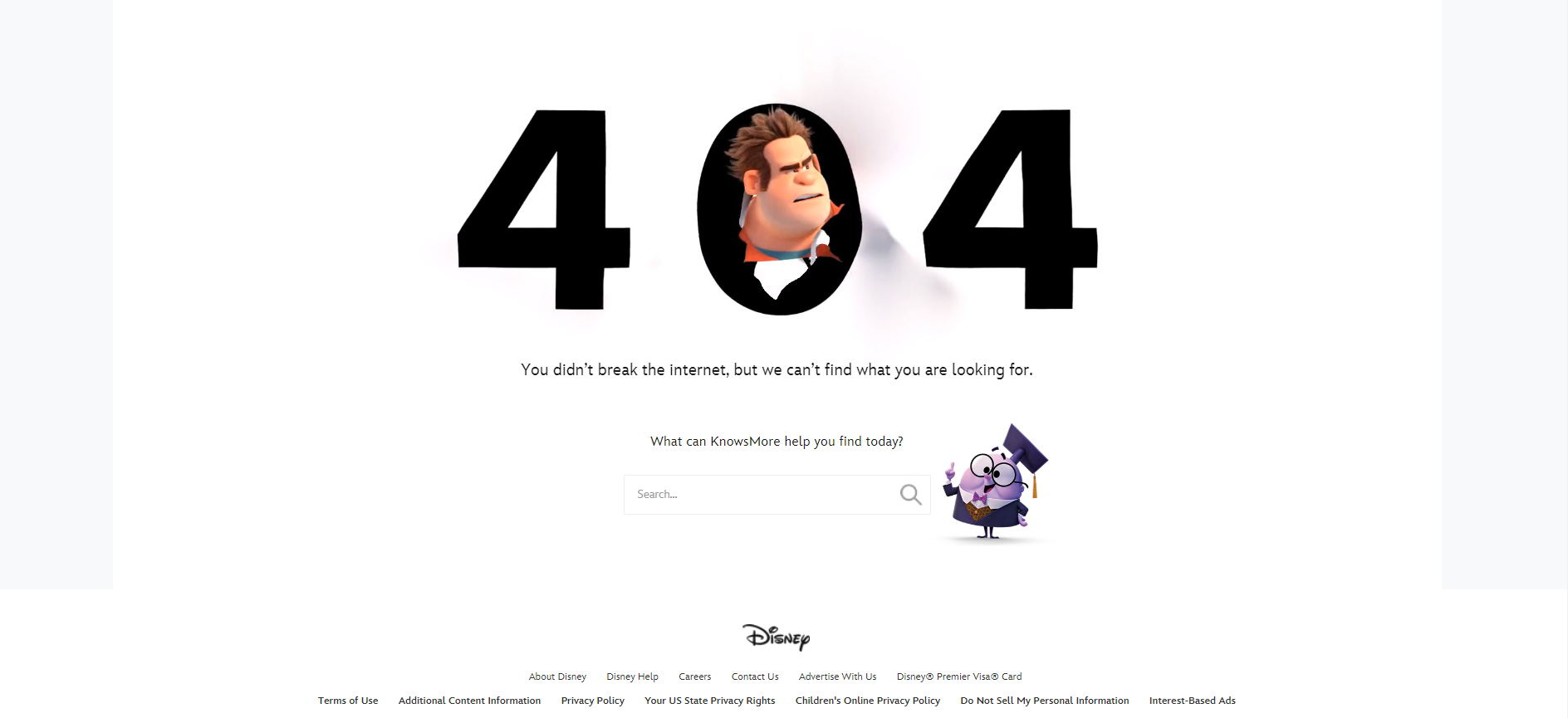
It’s funny and unmistakably Disney. Adding Wreck-it-Ralf to the mix is an adorable touch, while the toon below adds to the atmosphere. If users stumble upon this 404 page, they won’t wonder where they crashed. Instead, they will try to figure out what went wrong and either try again after checking their spelling or go ahead and use the search bar to find what they were looking for.
Stick to your brand voice
Sticking to your brand voice throughout every communication channel is crucial for your brand identity. Thus, your 404 page should make no exception. Make sure to maintain your brand identity. This way, users will find themselves in a familiar spot if they are regulars to your website. Moreover, this will increase the chance of getting the right people to continue their journey while weeding out those that won’t contribute to your success. Naturally, if you are a B2B website, your 404-page should also be much more formal and on par with what your customers would expect. For example, Monday.com
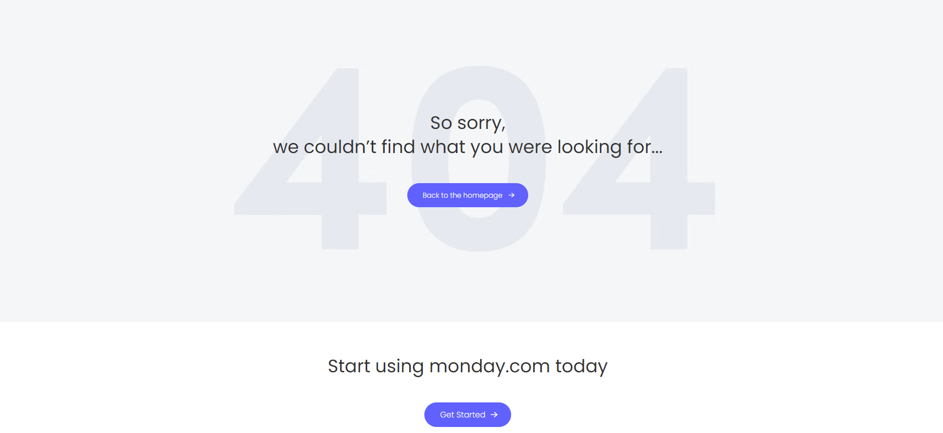
The platform streamlines work processes, so having an elaborate 404 page that will take a lot of time to digest would be weird. Instead, they opt for the simplest option. A straightforward explanation, a redirection, and a CTA.
Add some humor
Having a touch of humor can add great benefit to your 404 page. On the one hand, it would relieve the stress the visitor will experience when they make a mistake. It’s always awkward when you find yourself in the wrong place, so humor can defuse the situation. Furthermore, jokes mitigate the error, make the user feel welcome, and relieve stress.
Most importantly, however, infusing appropriate humor on your 404 page will retain attention.
It’s within human nature to try and escape from awkward situations. Thus, when you open a wrong door, you’re quick to shut it off, often slamming it. The same thing happens with getting on the wrong page or the 404 page. When you see your mistake, your first impulse is to try and shut it off. The humor aims to attract your attention, so you won’t just bounce but remain on the website and redirect to an active page. That’s why humor is most effectively transmitted through visual content, as people will first focus on the images and read the text later. A great example of this method of retaining the user’s attention is AirBnB’s 404 page.

The animation with the girl dropping her ice cream perfectly illustrates how you might feel when entering the wrong address. Moreover, it’s quite charming and instantly attracts attention. Thus, once you see this and you get a smile on your face, you are ready to see what solutions to the problem AirBnB has provided.
Make sure people know they are on an error page
That should come without saying, but making sure people are aware that this is not the page they were hoping to reach is crucial in retaining their trust and keeping them on your website. So, using visual hierarchy, make sure to explicitly state that this is your website’s “Page not found” page and not what they were looking for. Once again, you can check out Disney 404 page. Their 404 is enormous and instantly draws your attention. From the very first moment, you are alerted that there has been a mistake.
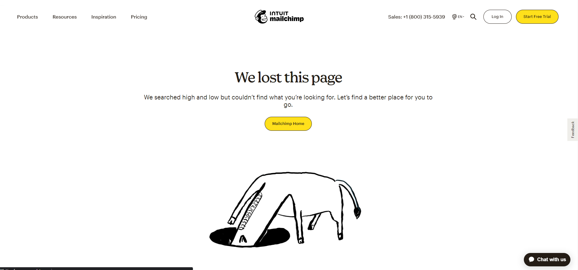
Add on-point visual
Just like Disney did on their 404 page, usually, one image is enough to tell the reader where they are. Not only regarding the redirection to the error page but also to the domain and brand.
Mailchimp does that to perfection, retaining its recognizable style, humor, typography, and illustrations.
Add a call to action
Adding a CTA that will redirect the users to a more useful page, or at least the home page, will bring you a long way. It takes off the stress, as you present an easy way out without getting back to Google or typing the URL anew in the browser above. Though most CTA’s actually aim to lead the user to a more useful page, you may even go a step further and offer your services right then and there.
Insert explanations
While informing the user that they have made a mistake, you should also provide them with enough information about what may have gone wrong and how they can fix it. Our 404 page does that pretty well while infusing other previously discussed elements.
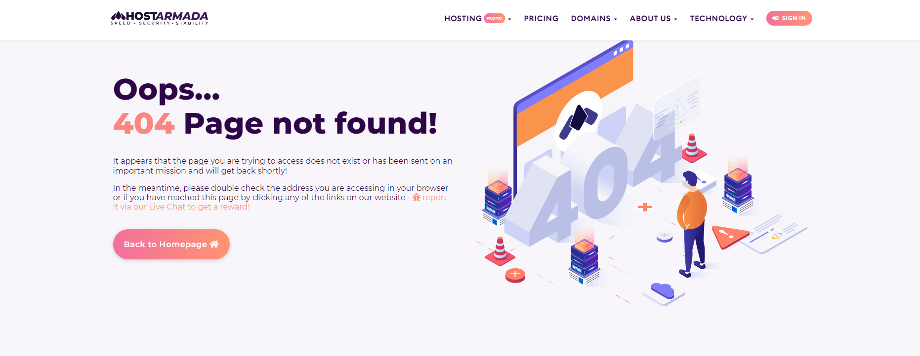
Looking at our “page not found” page, you will notice we translate the mishap both through our picture and visual hierarchy. However, we’ve also added a touch of humor, but nothing outside our usual brand voice. Most importantly, however, we added some additional information, explaining why the user came here, what may have gone wrong, and how to fix it. For the latter, we give them two options, one of which is a visually distinct CTA.
Following these guidelines will help you immensely in creating one outstanding 404 page. And while you are free to let your imagination roam, you should definitely consider some widely accepted don’ts regarding 404 pages.
Some 404-page customization don’ts
In general, your website is your canvas, and you are free to test and try whatever comes to mind. Still, finding that the stove is hot by burning your hand is not the most productive way of learning. So, instead of hurting your brand and losing authority, time, and effort to see that something is not working, you might as well consider some practices that fail 100% of the time.
Don’t use a generic 404 page
Using a generic 404 page is the easiest way to tell your audience you don’t really care about them. It also shows that you don’t care about your content either. If you cared, you would want to retain otherwise interested users and redirect them to active pages. The generic 404 pages are dull and faceless and won’t bring any of the benefits a customized page would. So, go the extra mile and customize your 404 page.
Don’t leave your 404 page as a bouncer
The point of having a 404 page is to retain the users on your website. So don’t treat it as a bouncer in front of a nightclub. Simply informing the user there was a mistake won’t do you any good. So make sure to add extra value to this page.

Microsoft is a great example of how your 404 page should never look. It’s dull and boring, and the only viable option for you is to exit the website.
Don’t make a random page your 404- page
This is another huge mistake that many novice website owners make. They simply place a prominent page as their 404 page, so readers will get to some content even if there is a mistake. However, not informing the readers they were not able to reach what they were looking for will only result in more confusion. Imagine if you are looking for a hat, but no matter how many times you click on a link that leads to hats, you receive shoes. This indicates the website is broken, and you’d never trust it with your sensitive information.
Don’t make your home page a 404-page
In the same sense, your home page is not a 404 page. Getting to your homepage is a bit better than redirecting your audience to a random page, but still, it will lead to some confusion. As stated above, it’s always a good idea to indicate that there was an error, so the user would know they won’t get what they were hoping for. Users will still get to your home page if you do it correctly. Still, you shouldn’t skip a step just because you don’t want to invest time customizing your 404 page.
Don’t over-clutter your 404-page
On another note, keep your 404-page as simple as possible. Though you need to translate some information, make it the bare minimum. No one wants to stay on an error page for too long. After all, from a sales point of view, this is just a deviation from the customer journey. So try to redirect users as fast as you can.
Be careful with pop-culture references
Pop culture references are an outstanding way to show humor and wit. However, you need to be very careful when using them. To be efficient, they have to be widely known among your target audience. But that’s not all. They need to be current or timeless, they need to be tasteful, and they need to address the issue at hand. That narrows down the useful references quite a lot.
So, if you have a great idea about a pop-culture reference, just make sure your audience will understand it, it won’t go out of fashion in about three weeks, and it won’t insult anyone. Otherwise, you are good to go.
Some marketing tricks for your 404 page –
Just like any other aspect of your website, marketers have found a way to weaponize the 404 page, making it most efficient toward your goals. That’s wonderful, as you can follow five tried and tested models to make your 404 page into more than just an Error page.
Make it a search bar
Firstly, it is a good idea to add a search bar. Whether the user misspelled the URL or there was a broken link, the user came to your website searching for something. Don’t waste this opportunity. By adding a search box to your 404 page, you offer them the chance to continue their search, but instead of the entire internet, they will search only within your website. This is a huge deal for you, as this is the first step toward converting the user into a customer.
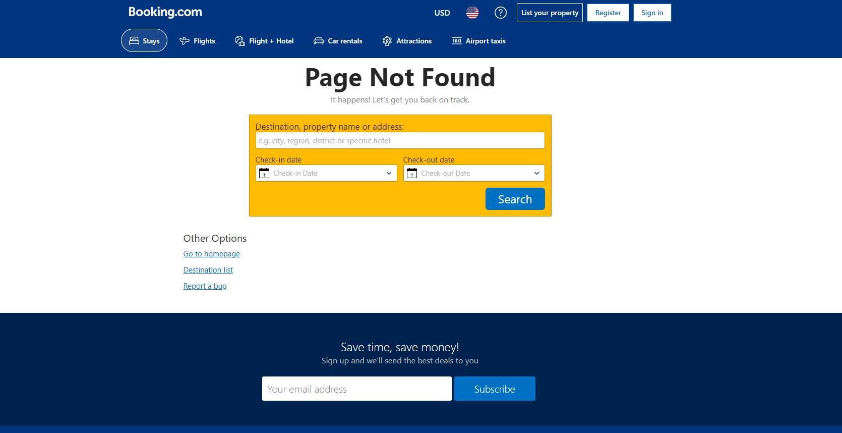
Booking.com is an outstanding example of effectively making your 404 page into an internal search tool. Even if you get to the wrong page, you can still just search for a hotel on your preferred dates.
Transform the page from an exit to an entrance.
From a marketing standpoint, each page on your website should push users toward the bottom of the funnel. The 404 page makes no exception. You might wonder why not just go for the sale. Well, people will be highly reluctant to buy from the very first step on your website, especially if their first attempt leads them to an error page. On the other hand, if your 404 page is well-designed and captivating, they might want to learn more about your product. So, your go should be to take their contact and convert them into a warm lead.
HubSpot does that exceptionally well.
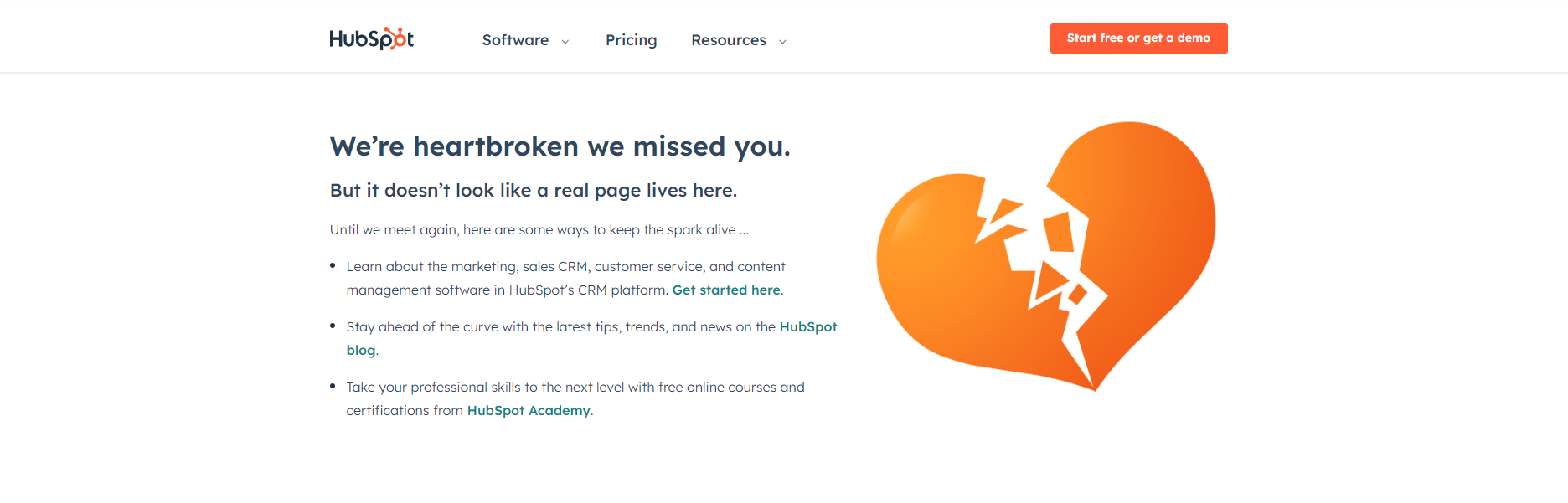
They have several links, all of which will lead you to a place where you will either leave your email or learn more about their product.
Make it an advertisement page.
If you are operating an e-commerce website, a good idea would be to transform your 404 page into a genuine advertisement page. Of course, that doesn’t mean you should disregard the main function of the page. You can still underline the user has gone to the wrong place, but there’s no harm in offering them your best products. For example, if a particular brand of shoes is missing from your website, you can offer a substitute. Hulu has done that impeccably.
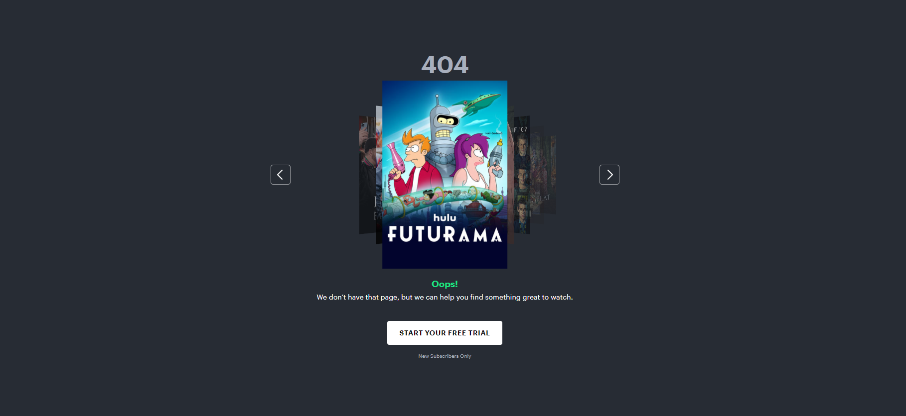
Putting an accent on “404” and “Oops” through visual features takes care of informing the user they are on an error page. However, the attention is instantly drawn to the carousel of Hulu’s best shows, which the user can flip through. At the bottom, the call to action is determined to convert. In this particular case, Hulu presents the deal with several pictures, which is quite effective.
Offer a deal
If you want to be even more aggressive with your advertisement, you can offer a deal with your 404 page. You can do it as a pop-up when the user leaves or infuse it directly on your 404 page like Fantastic Services did.

Adding a coupon to your 404 page will not necessarily lead to conversion. However, it will incentivize the user to learn more about your product. This is essentially a free way to acquire leads since the coupon will only be effective if the lead converts.
Make it memorable
Finally, if your website is not page heavy and you don’t expect a lot of 404-page visits, you can go for a slightly less persuasive version. Still, you must make your error page as memorable as possible, so the user would want to visit again. Adding a direct link or even a CTA redirecting to the home page is a must. Just look at JumpingJackrabbit’s 404 page.

It instantly draws your attention. The copy is witty and hilarious, and it definitely makes you want to learn more. To finish it off, they’ve placed an unobtrusive CTA that gently pushes you to “hop to the homepage.” Kudos for the brand voice dedication.
A 404 page is better than no page at all
As you can see, having a customized 404 page is paramount for retaining lost leads and pushing them down the sales funnel. However, to be effective, the 404 page should load as fast as possible. Otherwise, users might leave right after they see the 404 sign. For lightning-fast loading speed, you need our hosting services. HostArmada offers impeccable speed, 99.9% uptime, and impenetrable security. This guarantees users will get not only to your 404 page without a problem but to every other page. Check out our plans and choose the one that suits you best. If you have any questions, our team will happily lend you a hand. All you need to do is call us.